Museum rebrand
from the choices I’ve thought about wasn't sure what museum to go with, the ones I narrowed it down to were:
The museum of Quackery
The Museum of Death
The museum of Burlesque
and the Museum of Voodoo
— — I decided to go with Quackery or Voodoo because the death one didn’t really scream at me (no pun intended) and the Burlesque one i felt that as a man their branding would be in better hands of a woman.
Research
voodoo:
the Museum in at 724 Dumaine Street, New Orleans, LA 70116
Vodou, also spelled Voodoo, Voudou, Vodun, or French Vaudou, a traditional Afro-Haitian religion. ... The word Vodou means “spirit” or “deity” in the Fon language of the African kingdom of Dahomey (now Benin).

these are some of the images I found on their website


Quackery:
was in the St. Anthony Main location closed as of January 2002.
now inventory is in the Collection, currently on display in St. Paul, Minnesota, at the Science Museum’s “Weighing The Evidence” exhibit.
Info and imagery from their website


Well, as interesting as the Museum of Quackery is… the Burlesque museum still interests me. I still think a woman would take better care designing for the art of dancing Burlesque women, but as long as i am respectful and don’t objectify , I’ll be able to still do something nice and great. Also too the Quackery museum doesn’t exist anymore so that helped in that decision (lmao).


Thumbnails
Making thumbnails is always fun to me, but honestly the “mark” portion of the categories was certainly difficult.


For the voodoo museum, I played off things like skulls, animals, dolls, graphic elements from Haitian and hoodoo culture as well as things from New Orleans. things like St. John's Eve, candles, and even the New Orleans flag. For these I think I really enjoy the mascots the most, the word marks and the letterforms trail right behind because I would like the visit and come up with more possibilities for those that might even work better.


For the Burlesque Museum, I looked at things from the time in posters and the Burlesque daces and imagery. I probably got the most enjoyment out of the word marks, emblems and pictorial marks. When I think of burlesque i think of elaborate, beauty, glamour, and theatricalness. So in turn the ones i think best exemplify this were the word and emblems
Narrowing it down and getting the opinions of others, I came to these logos


The voodoo logos I don’t have a deep interest in besides the first 2 dynamic logos that are squared. The Burlesque ones, on the other hand, I really enjoy the word marks and emblems, but overall I love the calligraphic style as well as the “showy” style of the emblems so I believe that I’ll go with the Burlesque Museum for the rest of this. (although, I might work on those voodoo ones for personal reasons)
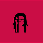
LOGOs DIGITIZE


really enjoyed doing the calligraphic style ones the most and i think they turned out the best. The other ones were mid and kinda just to get my brain going.
With further critiquing, the calligraphic logos were not that readable especially with the black stroke so I got the suggestion to go back and work further with the Emblem “B” so I did along with some more type trials and here’s what I got.


I decided to add more detail and get a font that would feel more professional yet have the contrast I would want, some of these I don’t have the “hall of fame” but I’ll try to add it nicely in the hierarchy as I go. The New font is called Desire Pro Medium and the subtext is Alt Gothic Compressed ATF

final changes

Now for the finale